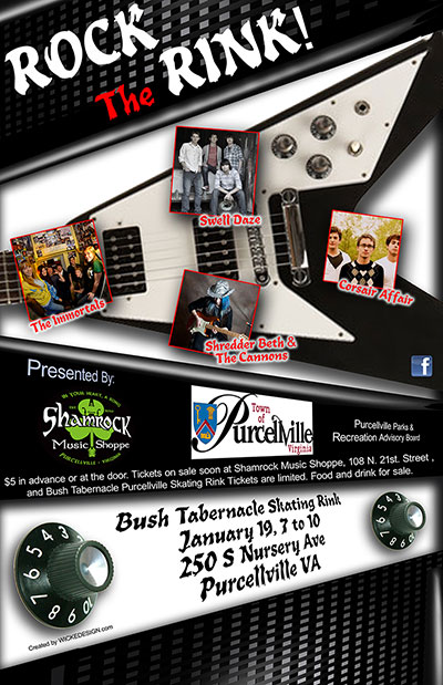
Rock the Rink was an annual town event in Purcellville, Virginia for several years. It has now become the Purcellville Arts and Music Fest, but the event’s spirit lives on. In 2012, the town commissioned us to create an attractive poster used to spread the word. We wanted to make it special.
This project literally began with a napkin sketch, drawn at a local hang out. The poster concept began with a V shaped guitar. Sharp contrasts and angled text would serve as the basis for the design. The purpose for this approach was to reach the family, and teenage audiences.
While realizing the guitar shape would not be enough, we introduced the shape of an amplifier as well. The guitar would be positioned in the top half of the poster design, while the amp would be displayed on the bottom. The idea of the amp positioned in a sharp angle would emphasize the goals mentioned above.
An initial draft of the poster layout used broad-angled lines to create a sense of motion. Heavy black lines placed on a white background further supports the goal of portraying movement, even stress. With the basics of the design laid down, it was time for details.
To create the mesh covering of the amplifier, we drew a series of repeating lines using Photoshop. These lines were then rotated 90 degrees to create the likeness of a mesh. Lighting was then applied to the meshed lines to provide contrast and a dramatic feel. Knobs were added to round out the design. The amp design was starting to come together.
To tie the overall look together, the amp grid was used as a design element in the top portion of the poster. The spaces between the main components then needed detail to help separate the elements. Using a 3D program, we created various black shapes and rendered them using bright white light. We then cut out portions of the 3D shapes and applied them between the spaces. In doing so, reflected materials appear to be a part of the design, as if it’s a wholly new object.
These steps fully established the background design for the poster. The next step was to add the text and photos of the bands. Angled text was used to reinforce the overall design feel; angles and motion. Several approaches were tried until the poster design began coming together.
The Purcellville Park and Rec Committee presented with an initial design for review. They loved the design. Edits were made to tighten the language and positioning. The final design was then printed and appears in local newspapers, and hung in store windows.
The Rock the Rink event was a well attended event and fun was had by all. Having the freedom to express oneself creatively is always a rewarding exercise.


