A website for the Town of Round Hill

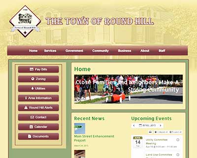
The Town of Round Hill needed a new website design that was able to meet a wide array of requirements. These included simple navigation, access to hundreds of documents, the ability to contact individual town government departments, easy event management, be mobile ready and provide training to the town staff.
Navigation
The first task at hand was to resolve the navigation and menu structure. Because the website required roughly 80 pages, making them easy to find was critical. How good is a website if it can’t be properly used by the town’s constituents? The task began using Power Point to plan the website navigation. Yes, Power Point. Why? Because the program offers graphic templates perfect for designing navigation. We like simple tools that can solve complex issues.
Using the hierarchy organization template, we began populating each shape with a page name. Then, added drop down pages depicted by connected shapes. As this graphic comes together, you begin to get a sense of flow. These shapes can be dragged to different positions to address potential page flow issues. Also, these charts can be shared with the client in proposals and design meetings. They often find their way into project agreement documents.
The high level navigation plan fell into three buckets; Business, Government and Community. Each of the pages fed by those menu options represents contextual information that naturally flowed. Then, a linking strategy was created to allow multiple access points to content. The left Sidebar of nearly every page offers a list of the top eight pages that visitors will likely be seeking. Considering the page access points of the top menu, and the left side buttons, you can envision a flow of page “consumption”.
Design
The town staff wanted to offer a Victorian look and feel for the site. To accomplish this, we researched colors typical of houses during this era. We then chose a palette to be used by the components, including buttons, text, back grounds and site details. Using an actual photograph taken in the town, we then began playing with header designs that leveraged the subtleties of the palette. The header image passed through several instances of editing in Photoshop before the resulting art was finished. In summary, the Town of Round Hill now offers a pleasing website reminiscent of its history, with a modern approach to accessing local town information.
The town also wanted to feature meetings, events and news items on the website. We designed the front page to automatically list the newest event and news bits as they are created. The newest items appear in lists at the top, keeping the front page information fresh. Each meeting and event can be access using the calendar. The news items are written in blog post form funneled to the front page helping to keep citizens informed.
Does your town, business or organization need a new website? Wicked Design will be happy to listen to your goals. Contact us for more information. Learn more about our Loudoun County website development services: https://wickedesign.com/2021/website-design.


