Here at Wicked Design, we are fond of creating graphic designs for the holidays, and then sharing them with family, friends and clients.

This year, we decided to create a wreath design, and share the process with you. This entire project began with an ink pen and a sketchpad. Below you will learn about the specific steps taken to arrive at this design. These steps included the use of Photoshop to graphically enhance the scanned drawing.
We had the idea of drawing holiday-like shapes that stood apart. We wanted familiar components, but also a design that was different. Using an organic and leafy approach, various shapes were drawn. The chosen shape design reflects a ribbon-like structure, but also one that conveyed something that grows.
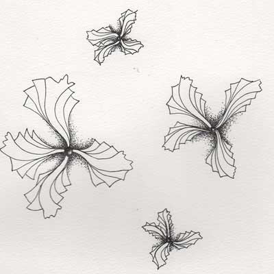
The pointillism effect (small dots) seen around the edges of the shapes were later removed using the Photoshop program.
The image shown here is a scan of the original drawing. In the steps below, you will see how we digitally manipulated the scanned drawing.
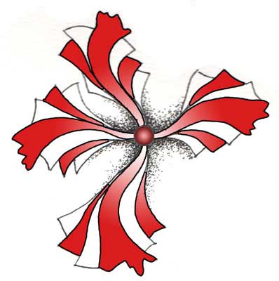
Once the hand drawn shape was scanned, it was opened in Photoshop. Using tools for careful selection, the edges of the “leaves” were surrounded to let the program know where we wanted specific colors to be overlaid.
In this case, the image on the right shows how the red gradient was applied to specific aspects of the ink drawing. The gradient used here shows a range of color from dark red to white. Because each single shape had its own color application, the gradient could be assigned to “travel” down each in a specific manner. This process was repeated for all of the similar shapes in the drawing.
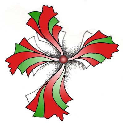
The process described above was used for assigning color ranges to the next set of shape stripes. A green gradient in this case, was filled used and serves to create contrast in the design. The drawn shape now begins to come to life.
Because managing many components in the program can be complex, organizing them was critical. For example, the red and green stripes each had their own layers in the program. This way, each portion of the soon-to-be complex design would be easier to manage.
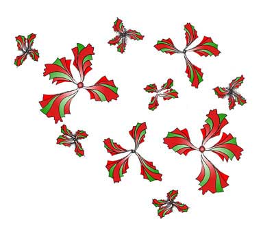
All four of the chosen drawn shapes received the same design treatment as described above. Once we were satisfied with the application of color, the shapes were then laid out to begin forming the inside of the circular shape. The final leaf shapes were then copied and rotated to begin filling the space. We arranged them such that it provided a sense of a holiday ornament, or wreath.
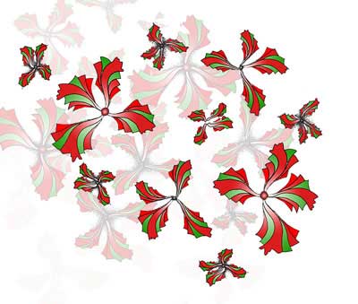 With the first layer of design leafs in place, we then began on secondary layers. These layers were built by simply copying the first layer, and then applying a different opacity factor to make the semi-transparent.
This process allowed the inner wreath area to be filled without overusing the strong red and green colors. The individual layers can each have their own opacity, or transparency, levels. This second layer has a 66% opacity setting. It was rotated from the original to provide the appearance of randomness.
A third layer of leaves were added behind the first and second. A circle shape was then placed behind the leafy shapes. This step helped to consolidate the design while getting closer to the desired wreath design. This third leaf layer can be seen around the edges of the image shown on the right. It has an opacity setting of 33%.
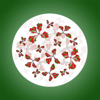
Next, we placed a circular green gradient outside of the white circle. This helped to “lift” the design off of the page and introduce another design element.

Inside of the white circle. Doing so gave the appearance of the snow globe, with floating objects. Once done, we began on create the outer wreath leaves. This step began by copying a single leaf design, from the start of the project, and making it tiny. Then, it was filled in with a solid green color.
The completed tiny green leaf was then copied around the entire outside circular shape, to form the wreath shape.

Because one color of green was not enough, this shape was the copied, rotated and filled with another shade of green. This step was repeated for a third time, forming the entire outside shape of the design. The three adjacent green colors compliment each other and give the appearance of fullness, or a complete wreath shape.
This method demonstrates how an existing graphic component can be copied and changed, as opposed to creating an element from scratch. Knowing your digital tools will help you design more efficiently. Of course, we’ve used Photoshop since version one, so we’ve been doing this for a long time.
To help give the outside wreath shape a bit more contrast, we added red berries. We used a single red sphere shape to represent a holly berry. This shape was then copied to form a small grouping of three berries. Then, this grouping was copied and rotated around the entire wreath shape. This step adds detail and familiar holiday shapes.
For the final design shown here, we added text above and below to convey the holiday message. Both lines of text received various treatments, including color and warping to fit around the shape. Making the text fit appropriately requires more work than you may anticipate, but it’s a worthwhile endeavor. To add a bit of humor, we included our company name associated with Santa.
Overall, this project took about six hours to complete. Often, the most time consuming aspect can be the design process itself. Many visual design approaches were tried at all stages to create good balance, design and taste. The actual pixel manipulation does not require that much time.
We hope that you enjoyed our graphic design story. Happy Holidays to you, and yours, from Wicked Design.


Leave A Comment
You must be logged in to post a comment.