Fairfax Architect Demands More from Website Design
When your client is an architect who engineers multi-million dollar buildings, a stand apart website design is critical. Knowing that the metro DC area is replete with competing firms vying for big budget projects, the new website design had to minimally be on par. However, architect David Sassano, of Herring Trowbridge (Herndon, Virginia), wanted more.
I began by researching the website designs of other major Washington, DC architectural firms. Much to my surprise, they all looked quite similar: Clean, lots of white space, narrow photos, and minimal text. I chalk these approaches up to an east coast business mentality. Serious, but boring.
To begin developing the new website design, I took into consideration all of the approaches of the other firms. In an attempt to raise the bar, I decided to introduce splashes of color, large slide photos, and irregular shapes. While remaining in the minimalist category, these components were leveraged for a more modern site that exudes more creativity than most.
“Logic will get you from A to Z; imagination will get you everywhere.”
― Albert Einstein
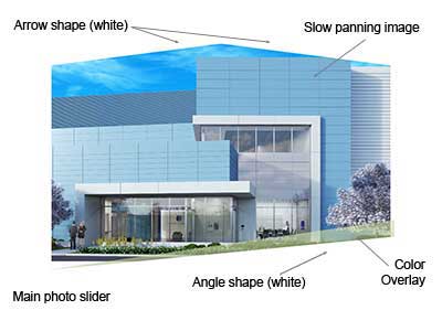
In addition, the Home page slider introduces slight motion. The three large slider photos pan horizontally in a way catches attention without causing distraction. It also allows the photographs to reveal their detail and breadth of design attention.
An arrow shape was fashioned to the top of the slide show. A diagonal shape was added to the lower section. These shapes immediately contrast with the straight edges of the browser, and page. While still conveying a serious approach to business, these components help the overall design to jump off the page. I feel that the east coast approach to business design can still be serious while showing some color, and creative risk.
Near the bottom of the page is a carousel of project images. While also serving as a image slider, this row of content features another shape meant to attract attention. A curved white shape covers the top portion of the row. All of these shapes help to create a unique design that will leave an impression upon web visitors.
While some of these design components are not the norm, they culminate to deliver a fresh breath of air. It’s sometimes easier to following in footsteps, but it’s more rewarding to create them.
Visit the new Herring Trowbridge website: https://HerringTrowbridge.com.
Learn more about our website and WordPress development services: https://wickedesign.com/2021/website-design