LoCo Joe is a new Loudoun County coffee shop. Located in Purcellville, Virginia, this fine coffee shop wanted to be different. They had a goal of offering high quality coffee using international beans, locally sourced baked goods, soups, bagels and pastries. They also serve fine teas from around the world, juices, lattes and espresso. The products are served in a hip Main Street location shared with an upscale interior decorating boutique (Everyday Elegance).
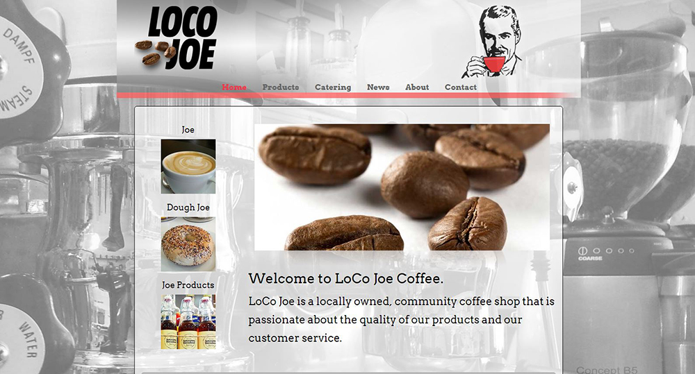 LoCo Joe wanted to reflect these values in the design of their new website. In addition to the fine coffee related products offered by the shop, they wanted to evoke a romantic feeling of memories from the past. This would include the design of their logo and a sense of the old industrial era complete with steam and machines. In summary, the words local, romance and fine products surfaced as being key drivers in the design and development of this Loudoun based coffee shop.
The first design step that we took involved leveraging a background image that immediately conveyed the important values of the shop. To accomplish this we took many photos of the machinery used in making their excellent coffee. The final image selected was of the espresso machine using a gray scale palette. Then filters were applied to soften the look while not distracting from the main website content. The photo fills a wide screen display regardless of screen resolution. It includes knobs, beans, steam nozzles and other related components.
The website body features cordoned area that each hold specific content types. The large photo slider is prominently placed at the top center. This area cycles through photos that each relate to the LoCo Joe business goals. These include coffee beans, pastries, bagels, latte art, Baristas and more. These photographs are used to immediately convey what this coffee shop is all about. It is true that pictures are worth a thousands words, and they leave a lasting impression with web visitors.
Next you will find a column that predominately features they types of products sold at the coffee shop. Allowing easy access to product categories supports the need for a simple and clean user interface. Along the top, you will find the expected menu choices, but allowing direct access to areas of the website is a good user experience. The photos also provide a visual target that captures fast wandering eyes.
 The mid and bottom section of the body area, resting on a translucence background, features text critical in conveying the business messages. Some of the keywords are set in bold to make them stand out, while helping to play upon the opaque backdrop.
In summary, all of the business and visual goals were met with a result that resembles a newspaper. Using a white, layered approach, a feeling of the forties is conveyed with images of machinery, coffee, black and white imagery and strong font design. This is the type of result that Wicked Design strives for with each website development project. We use strong design to create websites that stand out and represent the uniqueness of each business or organization. If you ar interested in learning more about our website design services, please visit this link: https://wickedesign.com/services/website-design/.
