Digital restaurant board menu design requires several creative skills.

We recently embarked on a project that involved replacing laminated, hanging menus photos with graphics displayed on wide screen television displays. This project required a food photography session, careful photo editing and significant design planning based upon the menu of Charcoal Kabob. This kabob restaurant has two locations, one in Herndon and the other in Reston, Virignia.
The project began with a complete analysis of the menu and related food items. We had to record each item and divide the available space. This allowed us to determine how large each photograph, or menu item, needed to be. Our goal was to fill three, 42″ wide, LCD television displays.
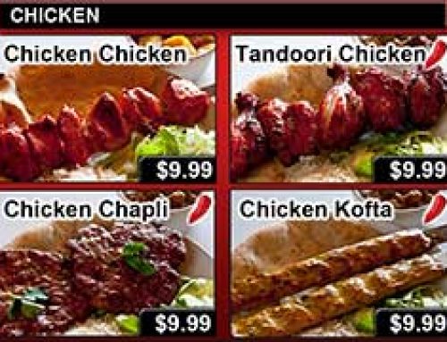
Having a complete understanding of all the menu items was critical. Knowing that the three TV’s would encompass all of the menu graphics, everything had to fit just right. Then, we had to account for the menu prices, the sizing of photographs and spacing between everything. This process began with a template, shown above. Once the basic parameters were know, the visual design could begin.
Complex design begins with the basics.
The next step was to conduct a photography shoot of all the menu items, and there were many. The cook delivered plates of hot Kabob dishes to the front of the restaurant where natural light was used for the setting. We used industry tricks to give the best appearance possible to the food items. This included the brushing of oil onto to the meat items to provided that sizzling look. After a three hour photo shoot, we captured the entire menu.
While the photos were taken in high resolution, the final image used would be rather small. In addition, the photos would need to be cropped to fit specifically within the design template. The food images were also treated with various filters to enhance the the final look and feel. We had to take into account where the television displays would be hung, the lighting, the angle and several other factors.
Without the benefit of a studio, the choice was made to use natural lighting from the windows. We shut off the fluorescent lights, which are horrible for photography.
Below is an image of all three menus as seen within the Herdon restaurant. Much work went into ensuring that each menu items could be seen from the counter. Even with all of the graphic pre-planning, there were several factors there needed to be adjusted. The photos needed to be closer than anticipated, and increased brightness. We also needed to deliver a system that could be used by the restaurant to update prices. A system was developed where the menu graphics could easily be edited without knowing Photoshop. We delivered the background graphics with empty price holders. Using a simple application, the manager can change the prices within minutes and be up and running shortly. After the prices are updated, the final digital menu could then be loaded onto flash drives. These drives are then plugged into the televisions for display. The manager only needs to update the three thumb drives and plug them into the televisions. The system we developed could not have been simpler.
In the end, Charcoal Kabob has a beautifully designed (we’re humble) menu system that has a modern appeal. They also have a menu system that does not require a technician to use.
Wicked Design recently complete another digital signage project, this time using 3D apps. Read more about the 3D sign that we created in this blog post: wickedesign.com/3d-design/lobby-sign-design-3d.


